How to give your packaging greater visibility in builders' merchants and DIY superstores?
Towards a strong, recognisable and easily adaptable identity
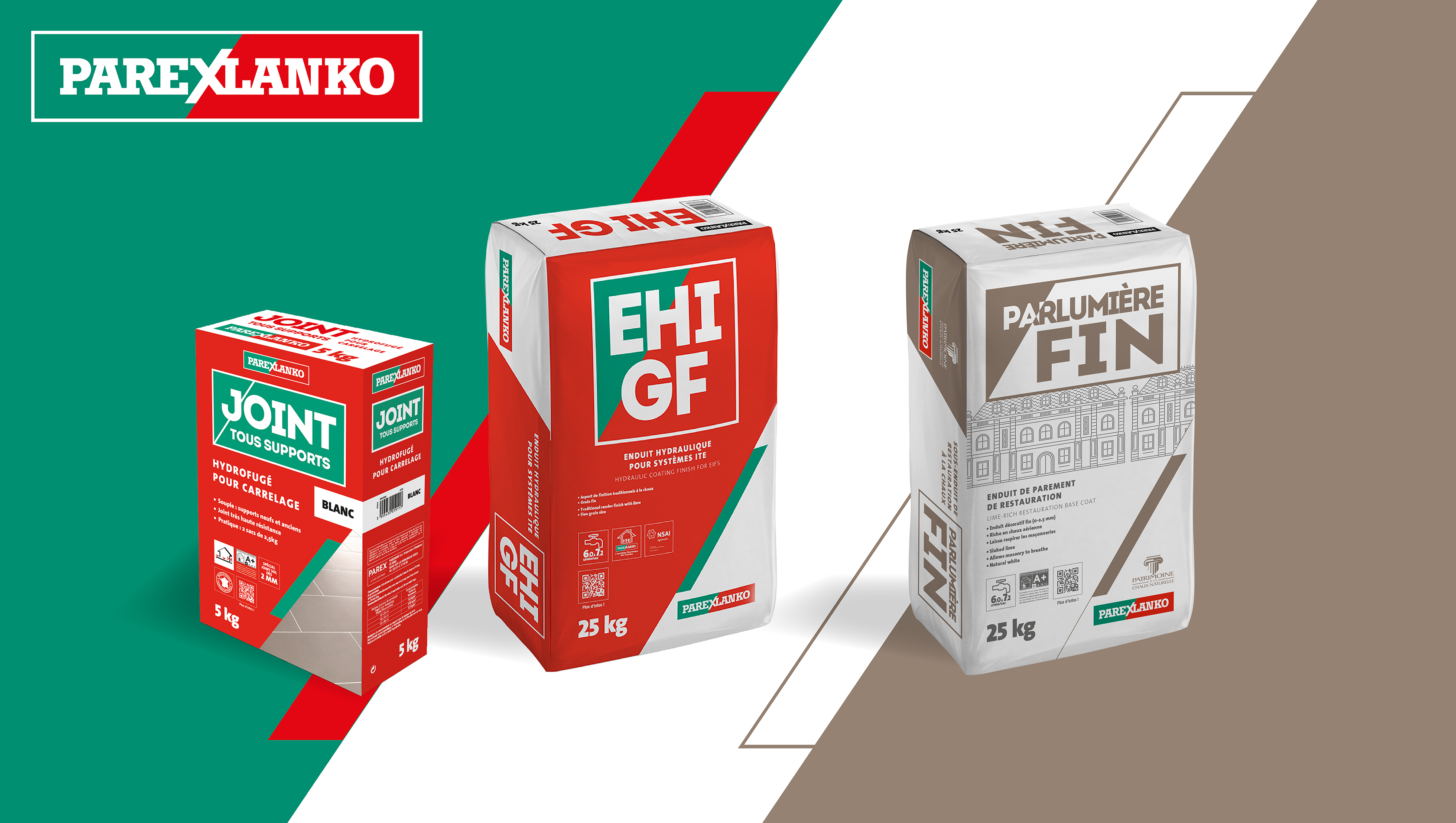
Parexlanko produces and markets mortars, adhesives and renders for construction and civil engineering professionals. While the brand has enjoyed an excellent image as a specialist for over 40 years, it nevertheless suffers from a lack of impact in builders' merchants and DIY superstores.
A wide-ranging communication plan was therefore initiated to give it greater visibility. In line with this overall strategy, Parexlanko wanted a root-and-branch rethink of its entire packaging line and called on the agency to support it in this ambitious project.
For the agency, the challenges were considerable:
- creating a strong, proprietary identity and anchoring it firmly in modernity
- elevating the brand's existing graphic codes
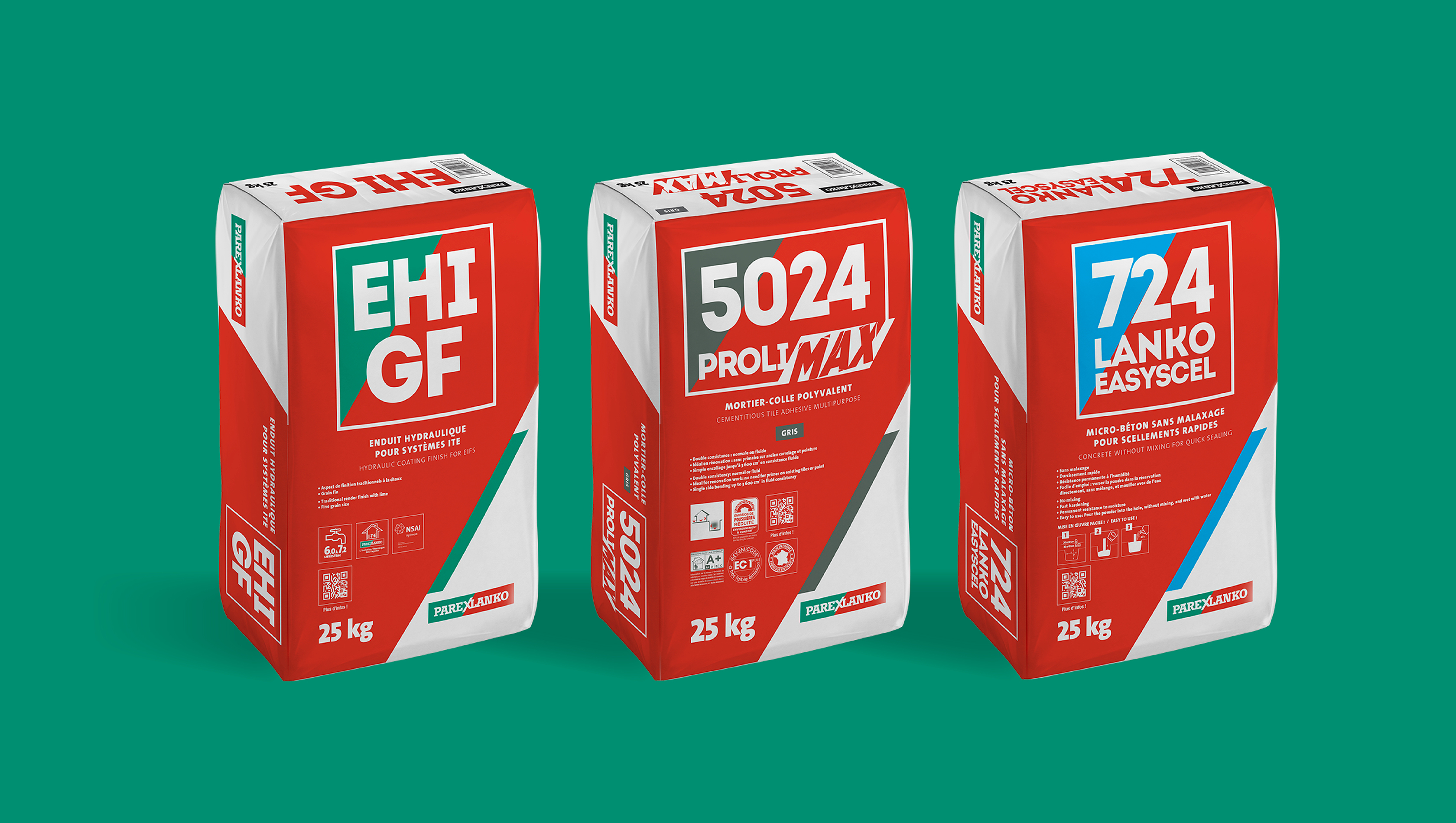
- applying the new packaging line across all product ranges and adapting it to the specific characteristics of the distribution channels
To meet Parexlanko's expectations and propose a modern, proprietary identity, the agency began by dissecting and analysing competitors' packaging. Overall impact, logo, shapes, colours, product legibility, modernity, volume of content…: everything was put under the microscope! This review made it possible to identify the dos and don'ts and draw valuable lessons from them.
While the graphic charter had until then been fairly consistent and uniform (bevelled shapes, use of Parexlanko green and red…), it was nonetheless ageing, and the packaging was no longer in line with the newly introduced guidelines. Meanwhile, the hierarchy of information was confused, with very few levels of reading and, as a result, no strong, identifiable stance. Overall, the brand's packaging lacked visual impact and modernity.
In our recommendations document, we therefore suggested the following points to Parexlanko:
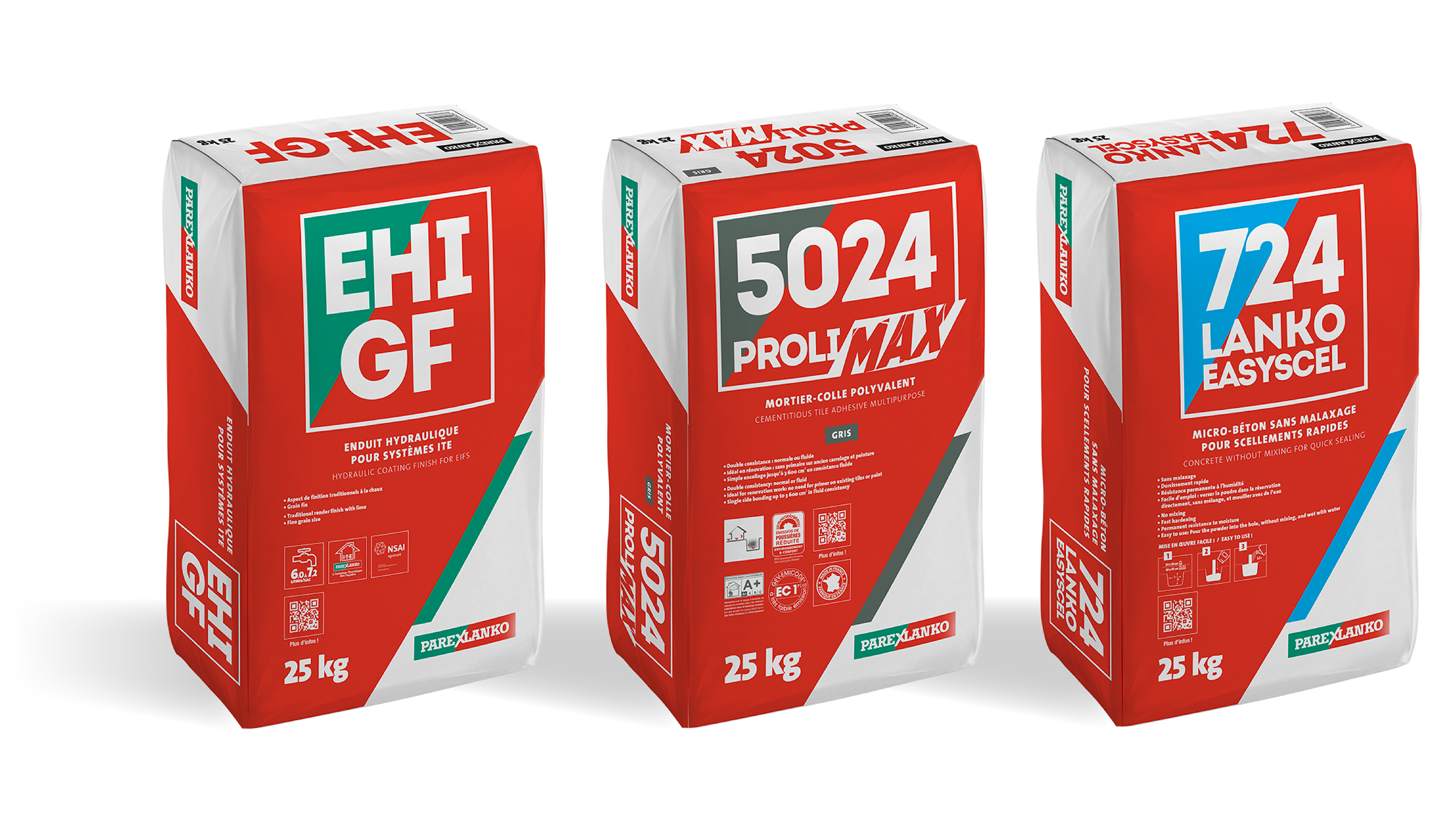
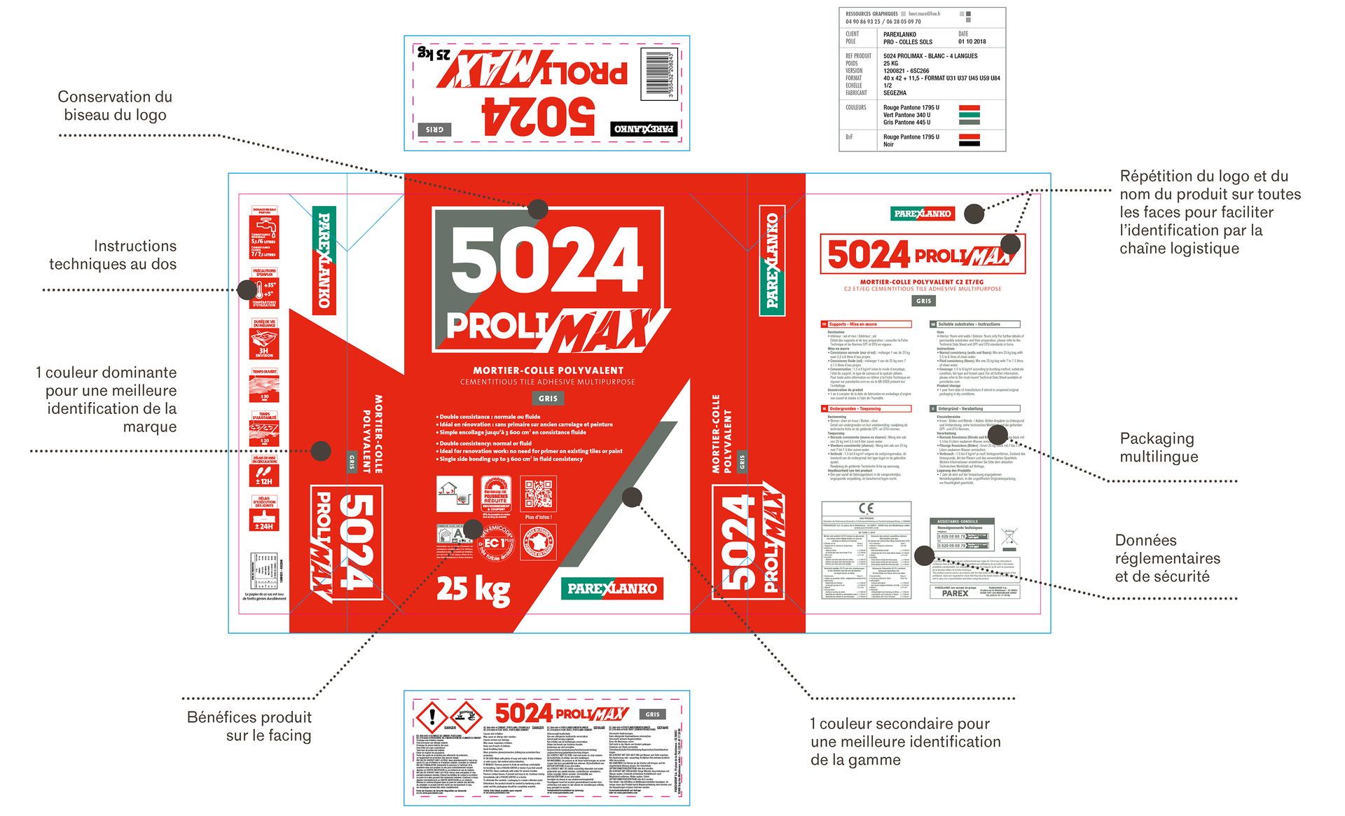
- the dominance of a single, unifying and identifiable colour, for better brand recognition,
- secondary colours assigned to the 3 product worlds (Façade, Adhesives & floors, Special mortars),
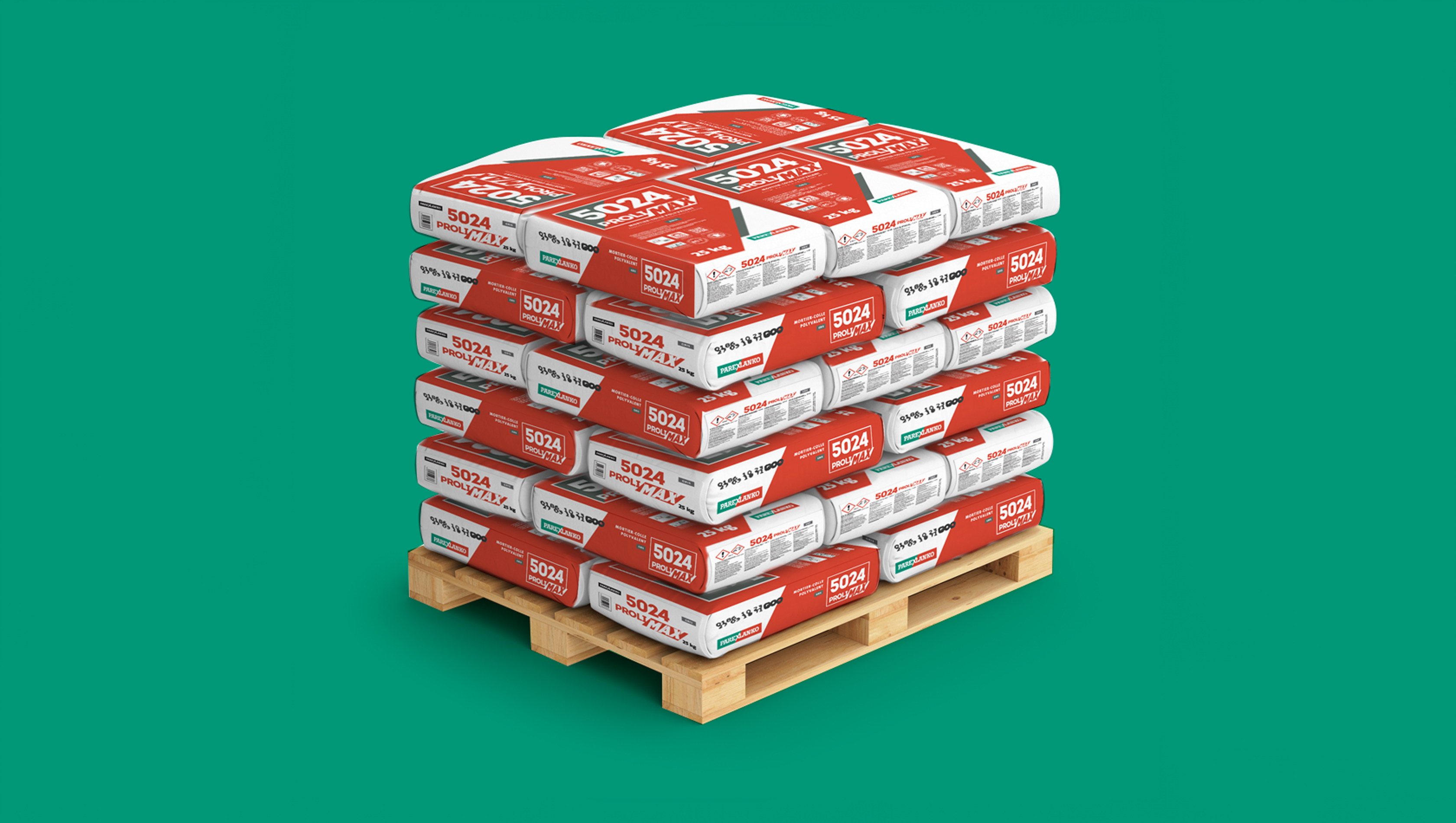
- repeating the logo on all sides so the logistics chain can identify products at a glance,
- using the new graphic charter for greater consistency,
- keeping the bevel in the logo, Parexlanko's “signature” graphic marker.
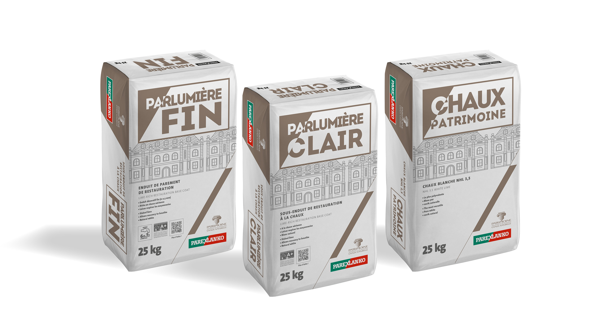
A year later, the agency repeated the exercise for Parexlanko's “Patrimoine” range. Here, the challenge was to adapt the brand's new packaging identity while respecting the graphic codes specific to a range of solutions for historic buildings: a dominance of white, a pared-back facing, a premium feel.
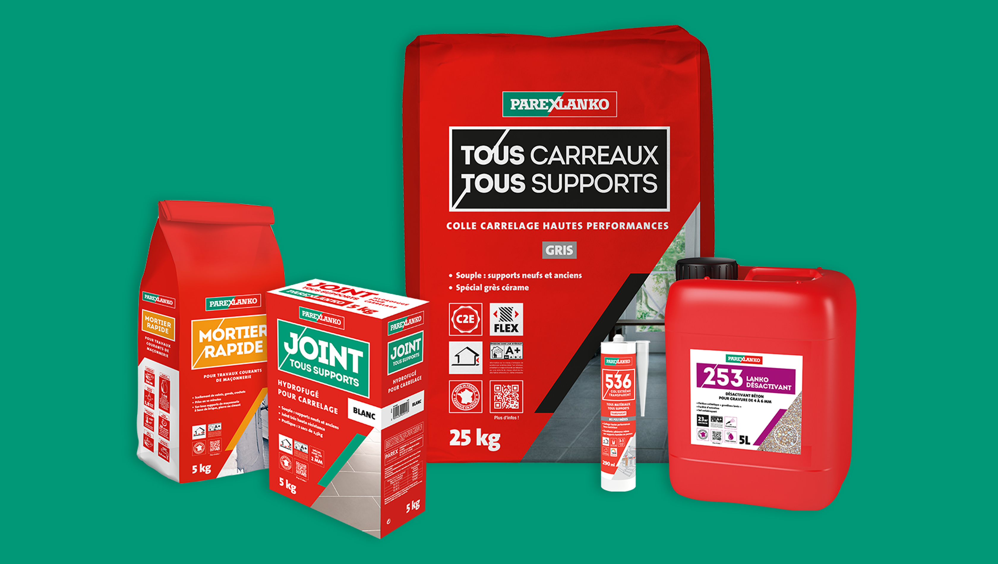
The new identity was also carried across to the products for the Consumer and Self-service division: drum, bag and box, cartridge…

Our finest collaborations, told by the people who know them best
Convergence provides us with high-quality support, delivered by a responsive and fully committed team. Their excellent understanding of our challenges and specific needs, combined with their creativity and ability to deliver, is a real asset.

Eugénie C. Communications Manager

Convergence stands out for its agile, professional support, offering excellent expertise across all of our launch projects. Strategies are tailor-made to our objectives and communication is always transparent!

Juliette T. Communications Manager

In CONVERGENCE we found much more than a marketing agency: a true strategic partner, able to understand our challenges, take ownership of our objectives and turn them into impactful campaigns, always delivered with professionalism, creativity and positive energy.
Nadine C. & Marion C. Marketing and Communications Officers

Convergence has been able to adapt to our organisation and has become a genuine day-to-day support as a hyper-specialist in communication for the construction industry.

Maxime B. Communications, Marketing and Specification Manager

Convergence imagined and delivered the tools best suited to the launch of our Elixair range, thanks to their knowledge of our sector, the quality of their work and their ability to push our thinking ever further. A true partnership of equals where we challenge each other to keep improving!

Katerina V. Global Communication Manager Pam Building

Thanks to Convergence's expertise in the construction sector, we were able to move forward much faster, developing tools perfectly suited to the specific needs of our B2B audience.

Rami J. Marketing and Communications Director

Working with Convergence makes a real difference on the various topics that concern us as a construction manufacturer. We don't need to train them — they already know the market.

Stefen W. Communications Officer

Convergence has supported us for 5 years, on one-off projects as much as on more strategic challenges. Their knowledge of the sector, of our clients and of our challenges is genuine added value, and our collaboration grows richer project after project.

Aurélie B. Client Marketing and Communications Manager

Convergence's specialisation makes all the difference! I particularly appreciate their responsiveness, their ability to listen and the thinking they bring to our projects. Their strategic and operational support makes for a valuable, effective collaboration.

Virginie Q. Operational Marketing & Communications Manager

Beyond the support we receive throughout a project, what is particularly valuable when working with Convergence is the upstream phase: they take the time to analyse the environment and the target audiences, and to take a step back. That is very important for our strategic projects!

Nicolas B. Client Marketing and Training Manager

Since I arrived in the construction sector, working with Convergence has been a real asset. Their understanding of the market and its customers, their creativity and the quality of their support bring genuine added value to our campaigns. A trusted partner who is a pleasure to work with.

Valentine G. Marketing Manager

A responsive, available and highly rigorous team, with solid expertise in the construction sector and consistently sound advice. Their creative approach gave our catalogue a real boost. A big thank you to the whole Convergence team for their commitment and the quality of this great collaboration.

Lauren C. Publishing Manager

The Convergence teams supported us in defining and structuring our new range. They helped us design a universe, messages and tools perfectly suited to our target audience, to convey the key information clearly and powerfully.

Alexandre P. Product, Communications and Digital Manager

Working with Convergence means being able to put yourself in the hands of an enthusiastic, efficient team that understands our business challenges perfectly. Thank you for bringing our projects to life.
Alizée E. B2B2C Marketing Project Manager

Thank you for your support — a successful campaign on every level, with KPIs that put a big smile on our faces 🤩

Anaïs G. Digital Specialist

When the time came to unveil our new brand platform, Convergence found just the right words to create a clear, impactful identity for us. Clients and employees alike embraced it immediately.

Priscille T. Operational Marketing Manager

Attentiveness, responsiveness, expertise and creativity are the words that best sum up our collaboration with Convergence. The agency has supported JELD-WEN in developing the brand for several years and has created a genuine campaign tone that quickly became the brand's signature.
Anne R. Marketing and Communications Manager

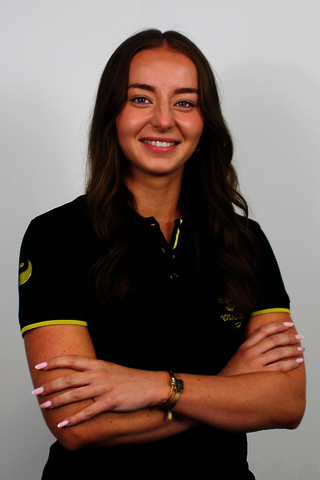
A great day-to-day collaboration: the team immediately understood the PUM universe, while bringing innovative ideas to the table. Special thanks to Véronique for the quality of our exchanges and her responsiveness, which make projects smooth and efficient.
Lea C. Commercial Communications Officer

Discover our projects and work through our client case studies
Discover all our case studies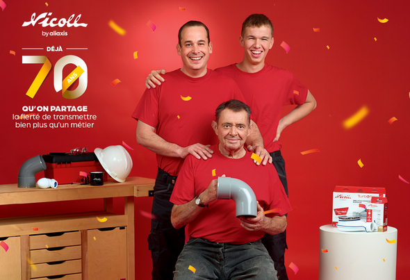


How do you celebrate a brand anniversary alongside the trade? A campaign that celebrates the brand by talking about others
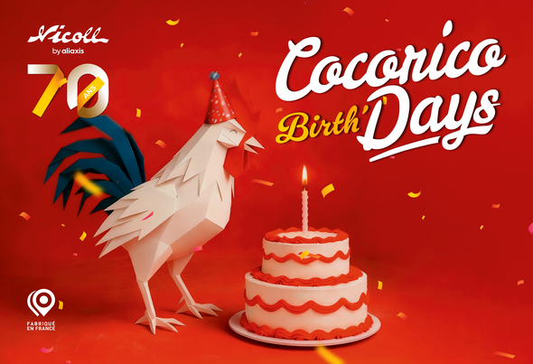
How do you turn a sales campaign into a must-attend event? When a sell-out campaign is fully embraced on the ground
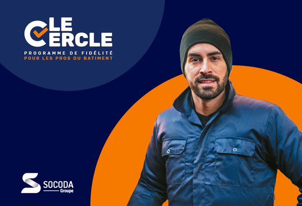

How do you turn a loyalty programme into an engaging relationship lever? Convergence supports Socoda in modernising its B2B loyalty programme
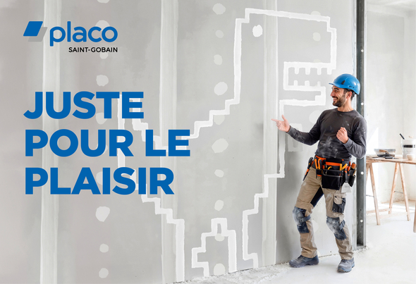

How do you relaunch a range in an ultra-competitive market? Creating preference among tradespeople by turning a technical task into a source of pleasure.

How do you turn a technical brand into a strategic partner for architects? Showcasing expertise to create value and anchor the B2B relationship for the long term.